Overview
Pro app is an e-learning platform focused on educating all things design. This platform aims to offer an all-skill inclusive learning experience to users by offering them a catalog of bite-sized courses, classes, and challenges to choose from. People learning on the platform could benefit from offers, reminders, glossaries, and course structures to decide and improvise their learning habits accordingly.​​​​​​​
As a content and UX designer, I was responsible for understanding different types of learners who came across the platform and understanding their expectations to design informative content and product experiences across the Pro app. I also played a major role in producing content for core courses such as UX Design, Architecture, Game Design, and more hosted on the app. I was working on this project for a duration of almost 80 weeks.
Problems
Enable learners on the platform to get a better idea of course content to make a learning plan accordingly and aid their learning routines with assistive features. Feature instructions, empty states design, and deconstructed overview of courses can help with essential supplemental content for courses and features built around them. Content and design-based decisions can help educate users about highlights of features and help make learning decisions.
1. User: Undesicive about choosing courses, exiting the app to look for meanings, not using benefits.
2. Business: Help increase user app retention and reduce overall exit rates.
3. Product: Keep the learning experience informative, immersive, and engaging for all levels of learners.
Design Process
User motivation and habits were key to understanding user expectations and behaviors while learning on the platform. Their needs demonstrated the need of developing a better content-informed design for learning-emphasizing features that enabled the users to make the most out of their learning on the platform.

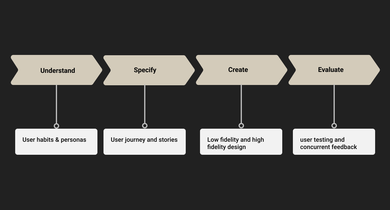
UCD Process followed for making content and product design decisions.

User research
Exploring different kinds of users, we came across three types of users who learn on the platform. Each type of user, their frustrations, and their motivations are covered through personas demonstrated below:
Expert learner
• Are typically familiar with the majority of concepts with the UX design.

Use the app irregularly on the basis of their availability but love exploring new design disciplines.


• Profound of domain-specific questions and open to engagement.

Help propagate the benefits of learning to fellow peers and beyond.
Competence learner
• Are familiar with basic concepts of UX design but are learning comprehensive topics.

Use the app regularly following a planned routine to keep up with their calendar.

• Typically inquisitive and often spark conversations among various forums.

Focused on exploring by themselves but helping propagate their medium of learning.
Novice learner
• Are unfamiliar with the majority of concepts within the domain of design in general.

Use the app irregularly on the basis of their availability but often juggle across various topics to fuel their curiosity.


• Often lurk across various communities to look for answers to several questions.

Soaking up what they see on screens to see if it's a good fit for them.
Prioritization and identification of personas resulted from an emphasis on developing an empathic connection with the users using the App. Personas based on actual conditions were to be constructed in order to properly steer the design process.
User Stories and Journeys
On the basis of user data derived from reviews, user stories were framed to explore end goals people were trying to achieve through the app. Agile user stories were utilized in this study to assist in creating a simpler description of requirements and prioritizing how the necessary functionality would be delivered in the app.

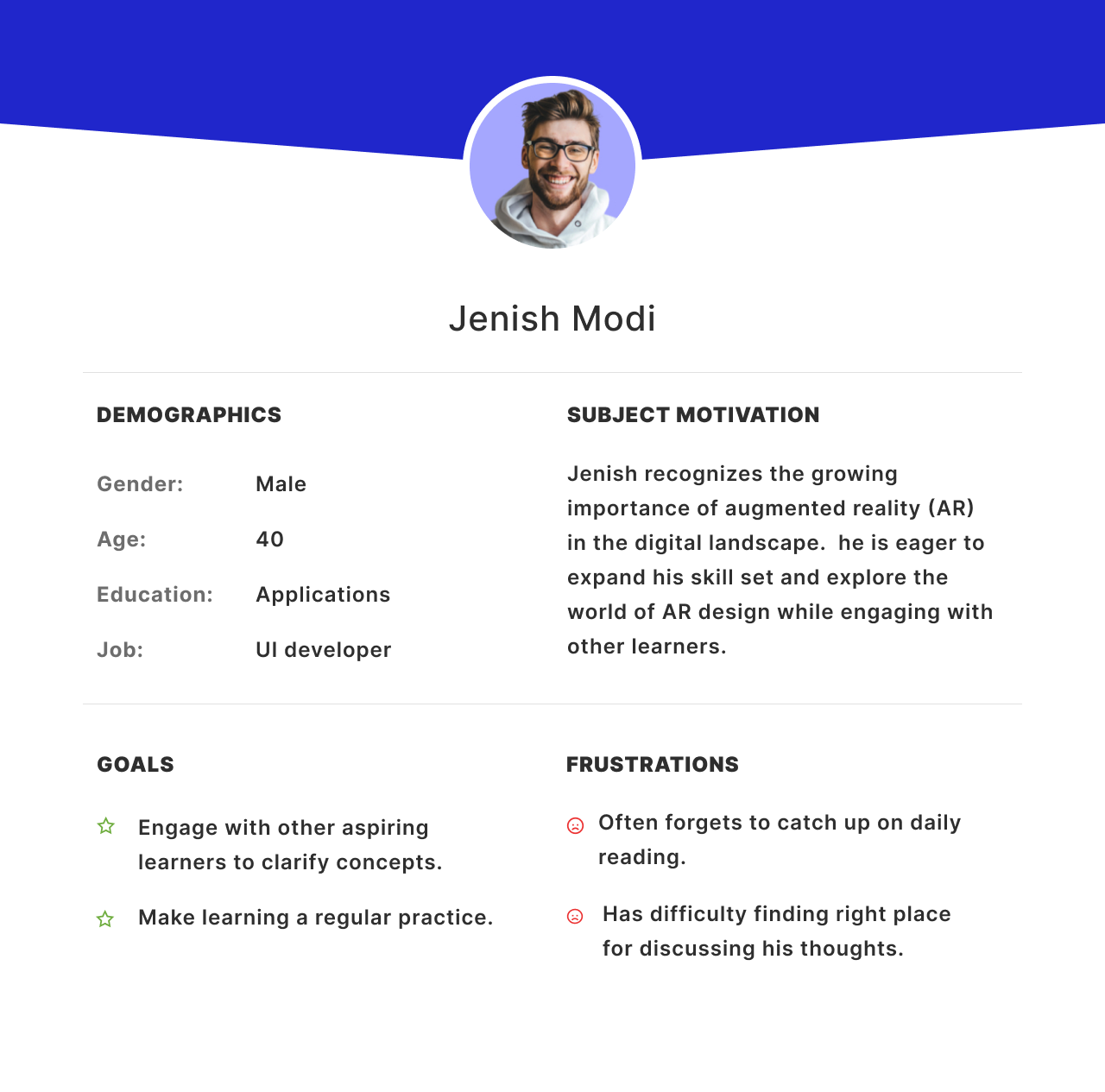
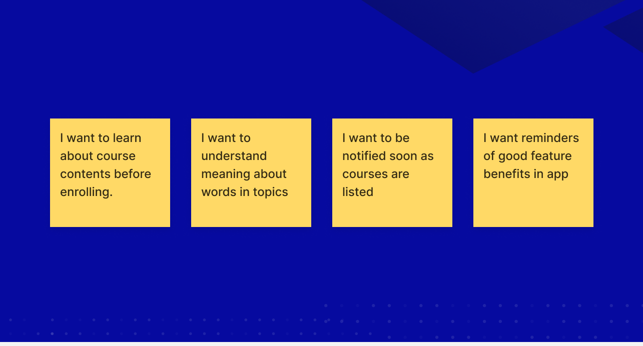
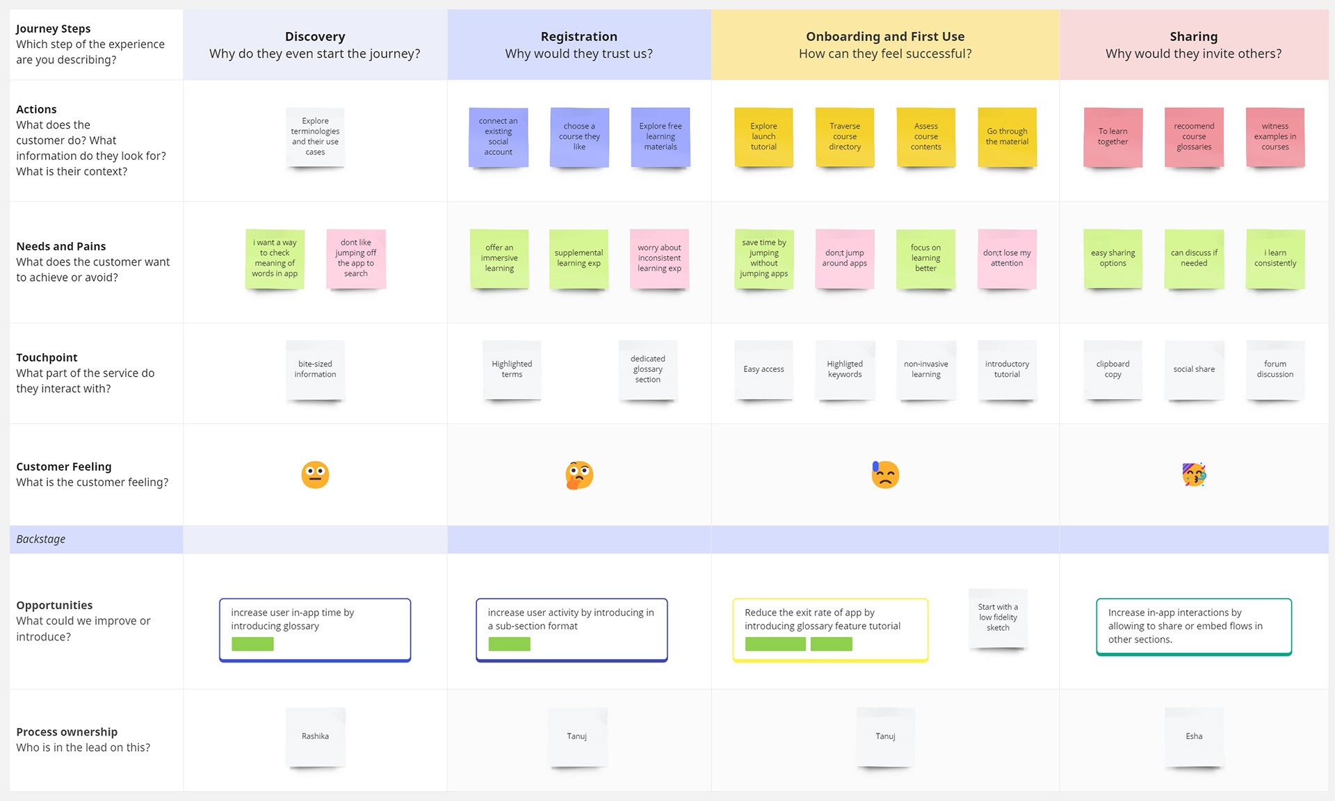
Typical user journey of a novice learner - trying to learn and understand meaning of technical words.

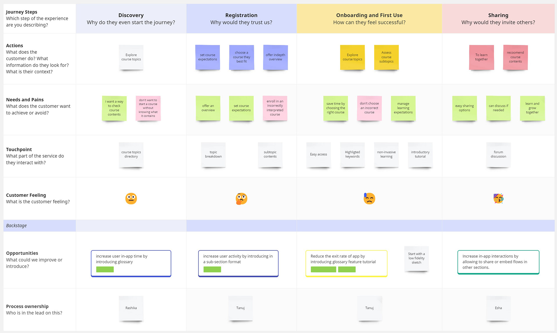
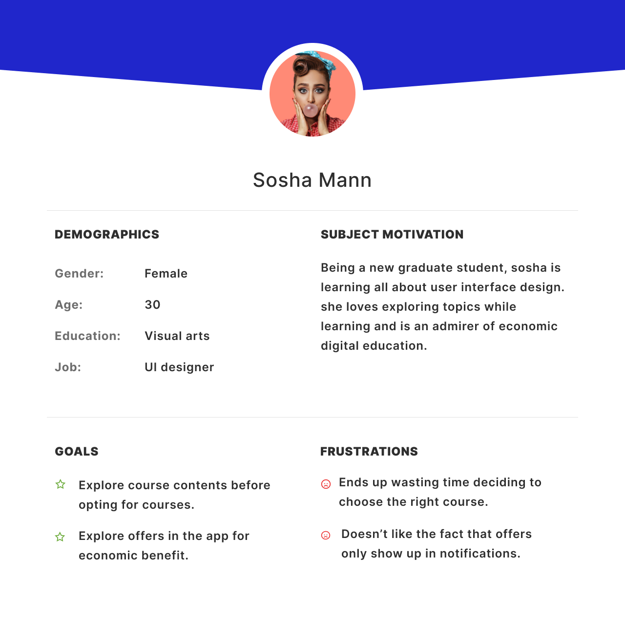
Typical user journey of a competence learner - trying to explore course contents.

Design
Visual decisions were needed to streamline the hierarchical layout of content among screens to make information consumption easier among learners. The goal was to explore an intuitive content layout approach to reduce the cognitive load on users.

Low fidelity sketches
Sketching out ideas gave fresh perspectives on content layout and information dissemination across various app sections.

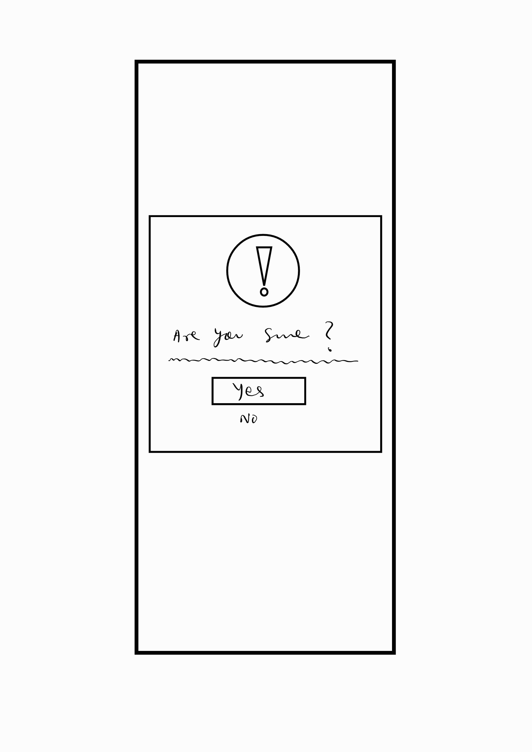
Sketch 1.1: Initial Idea for the exit confirmation screen. 

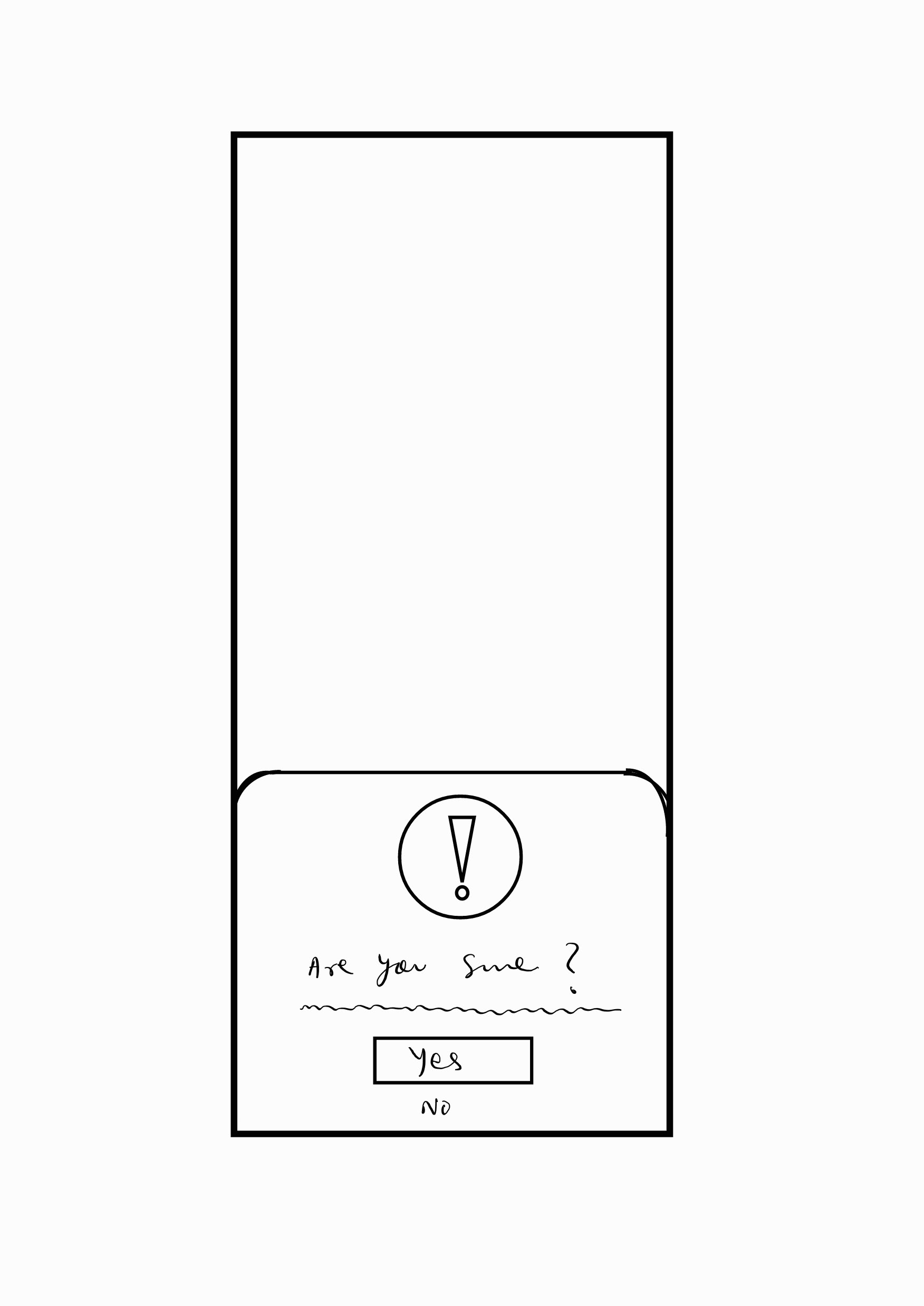
Sketch 1.2 Updated Idea for the exit confirmation screen. Considered addressing the finger reachability issue and improved one-hand usability. 

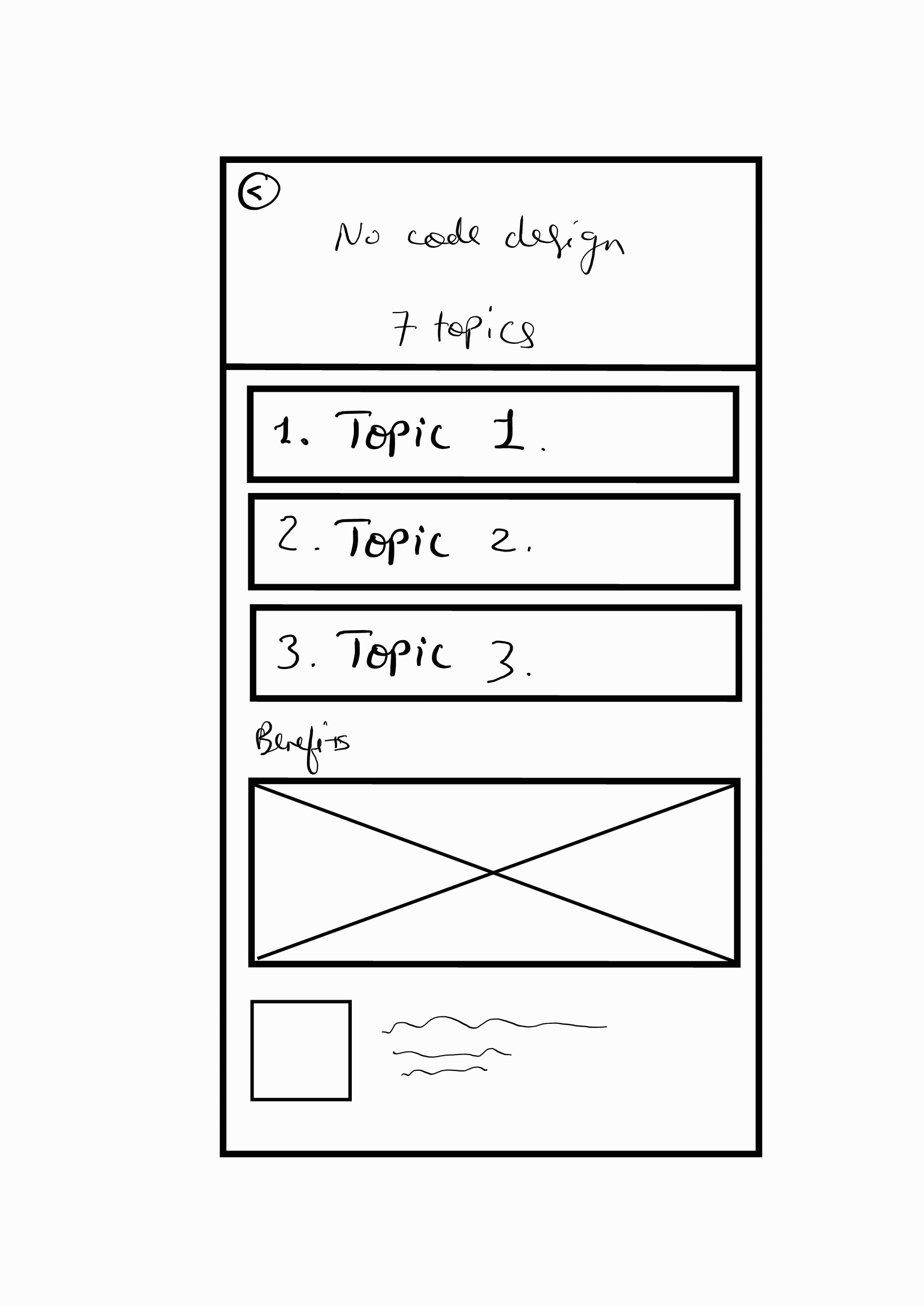
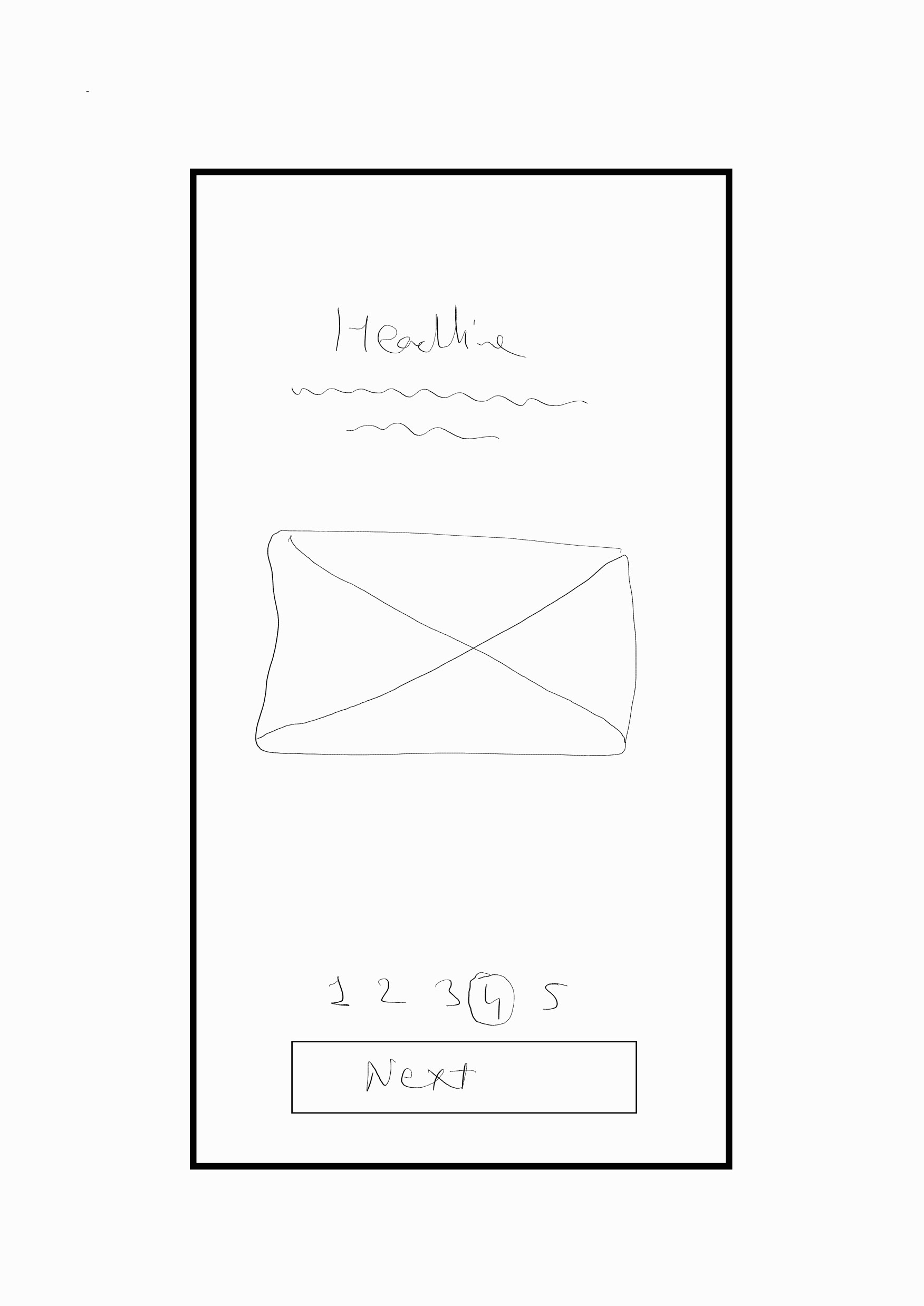
Sketch 2.1: Base view for course overview screen. 

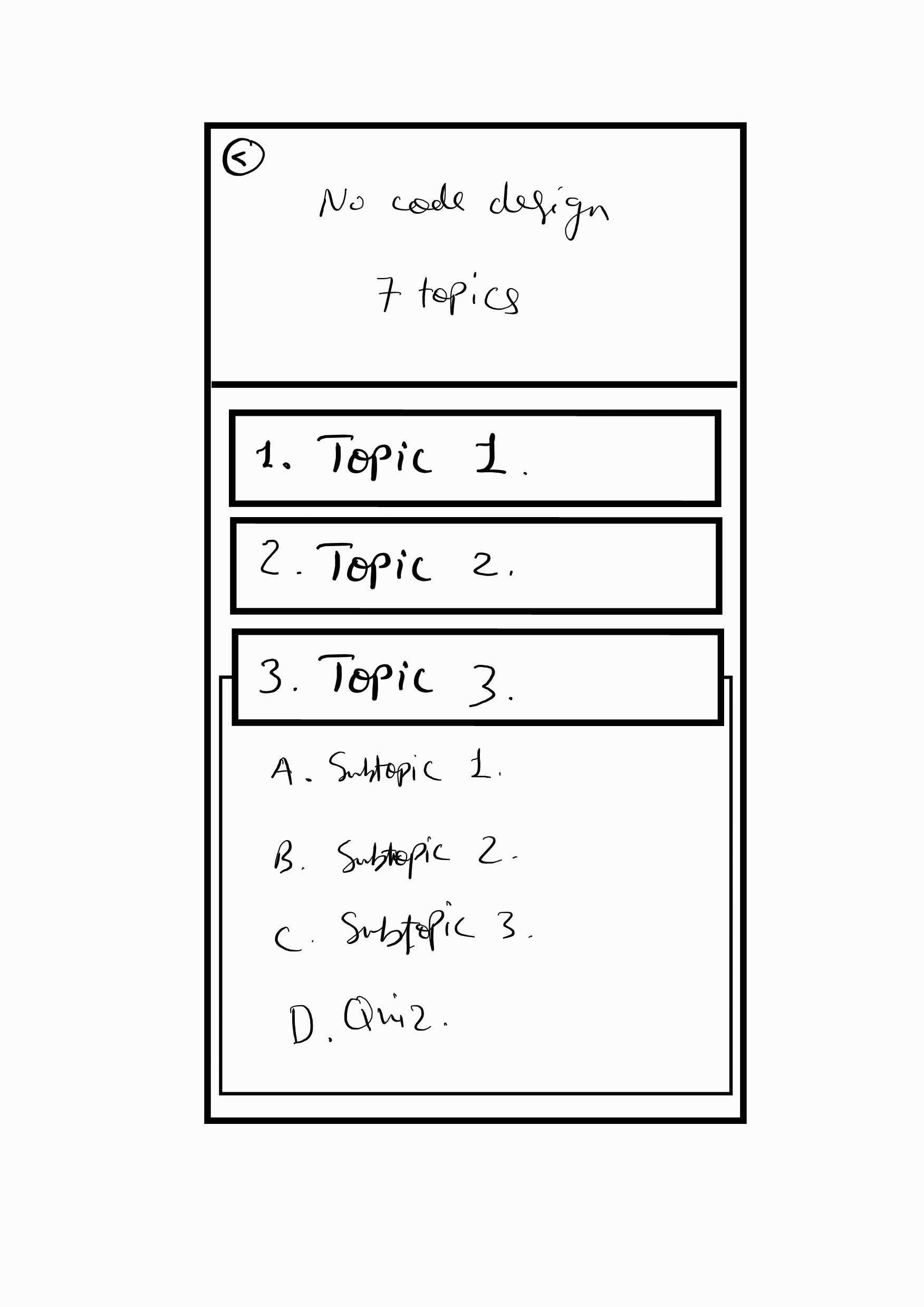
Sketch 2.2: Expanded view for course overview screen. 

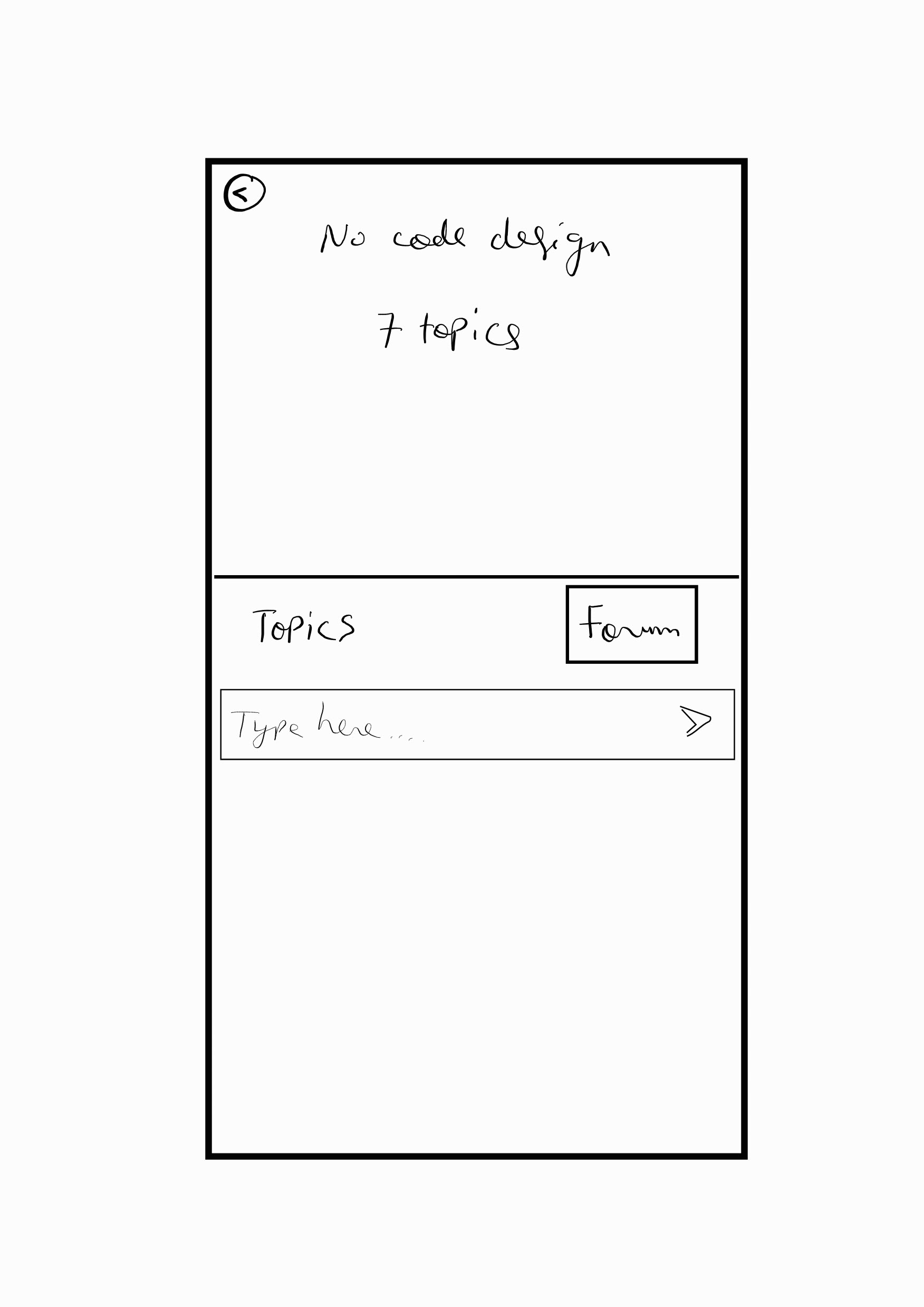
Sketch 3.1: Initial Idea for the course forum screen. 

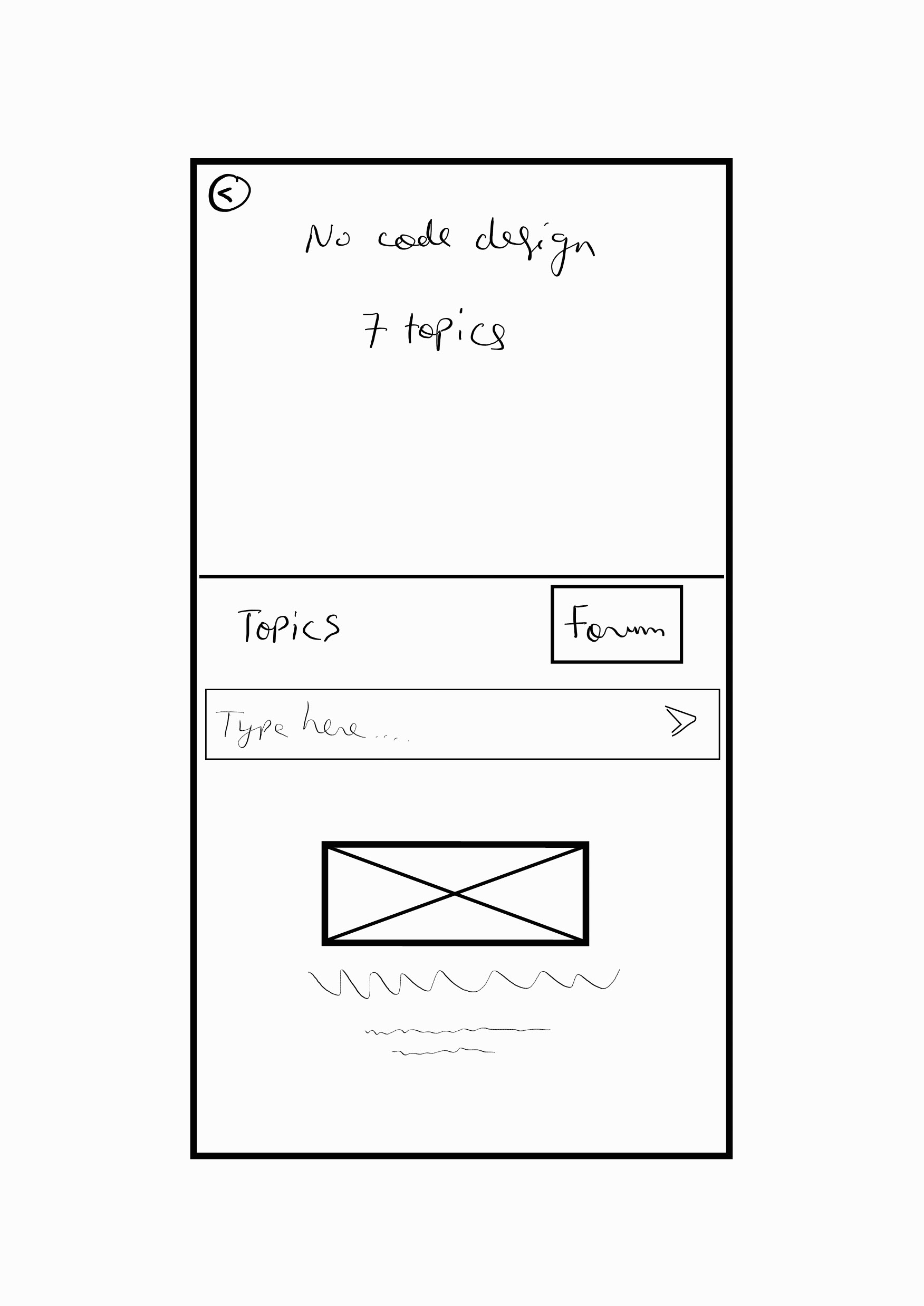
Sketch 3.2 Updated Idea for the course forum screen. Considered adding an empathetic touch to the forum space with a visually aided copy to drive users for engagement.

Sketch 4.1: App onboarding screen. 

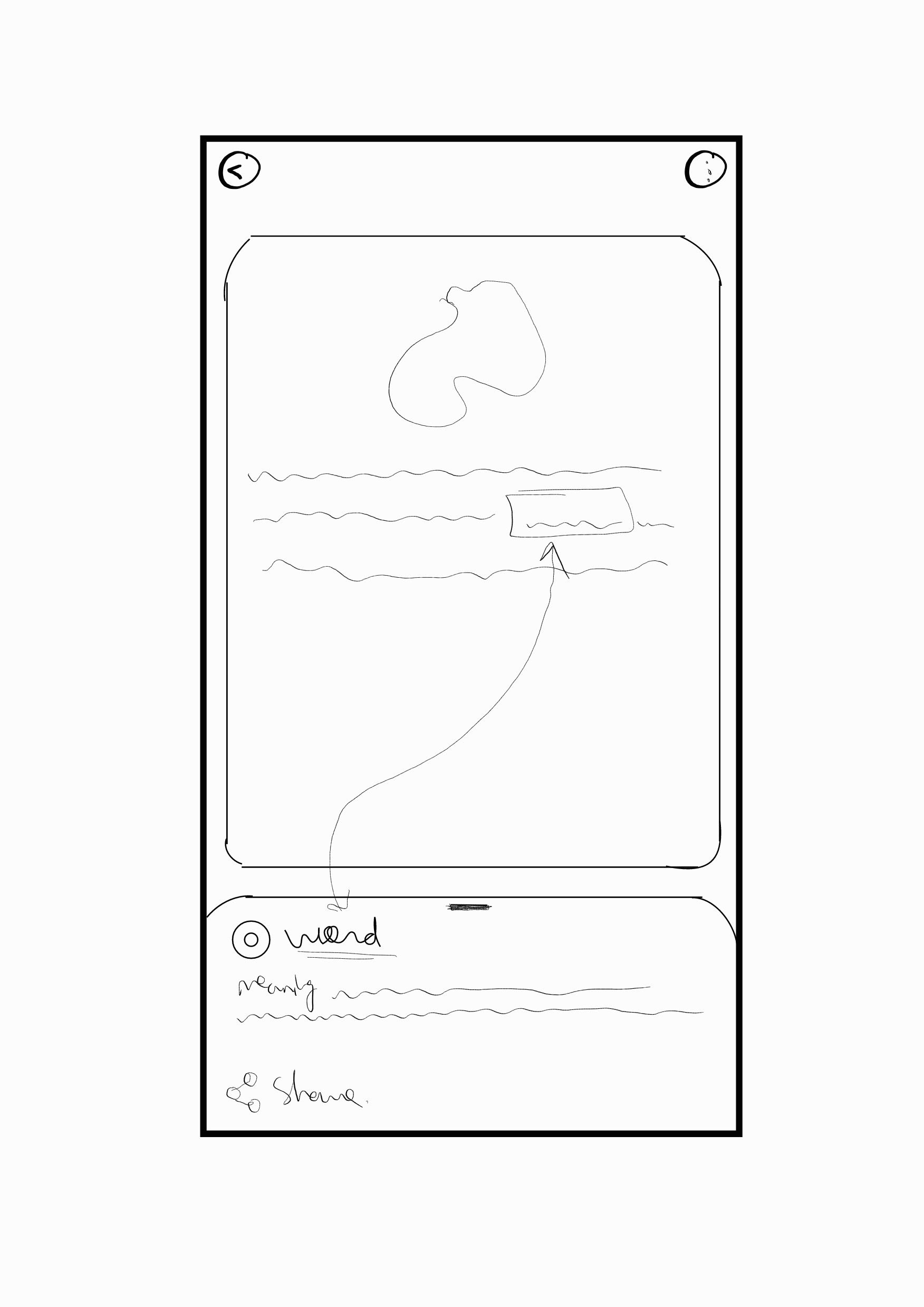
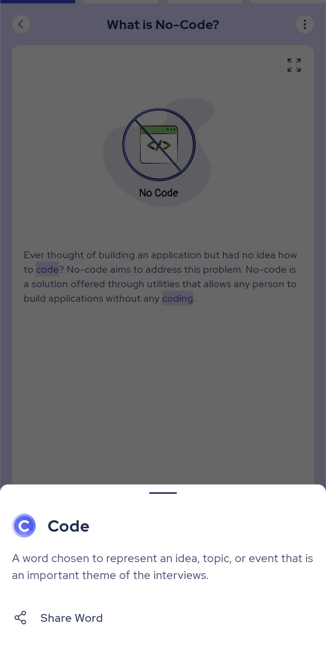
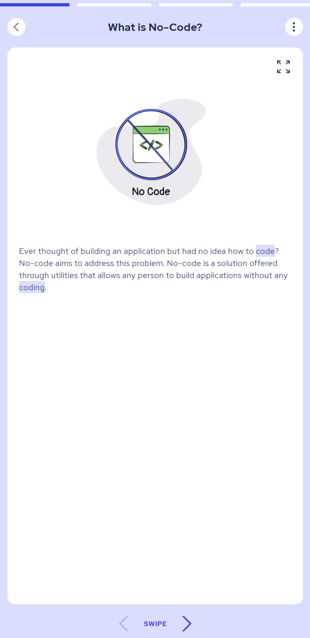
Sketch 4.2: Word glossary popup. 

High-Fidelity Wireframes (incl. Copy Decisions)
Upon approval of ideas sketched in low fidelity, high-fidelity wireframes were then prepared to keep user journeys in consideration. The wireframes also embedded copy decisions ideated during the low-fidelity design phase. The high-fidelity wireframes of the mobile app are depicted below.

Explore offers & Set reminders
Pro's mobile app helps learners make the most of their learning experience through lucrative offers and intuitive learning reminders. Users would often skip out or have difficulty recognizing their benefits. An exit confirmation screen was sketched and a wireframe was designed to help educate users about the benefits of these features.
Explore course topics and outcomes
Pro's mobile app offers several design discipline courses as a part of its offering. Each course topic covers various subtopics associated with it. Users requested to have an overview and benefits included on the course page so that they could make a decision about taking a course before dedicating their time to it.
Engage with learners and teachers
Course students can choose to engage with other learners or ask questions about course topics and subtopics. User research demonstrated users often jumped off the app to look for answers to questions that they encountered while taking courses on the app. With one design iteration focusing on a visually aided copy, users were able to get a clear insight into what the forum section represented and encouraged them to ask questions.
Overview at a Glance
Quickly get an overview of app benefits and look up technical words right in the app with the help of the glossary feature. Users also jumped off of the app to look for the meaning of technical words they encountered while taking the course. As a result, a glance glossary design was incorporated into the app to reduce app exit rates and help learners stay immersed in learning.
User testing (incl. Feedback inclusion)
I conducted rapid usability testing with 10 participants to validate design decisions. This testing was conducted with the aim of evaluating clarity and understanding the user perceptions towards different feature implementations designed to accommodate user habits and requests.

Issue #1: Users couldn't perceive if the forum was an interactive section or not.

Original Forum Section

Redesigned forum section with an engaging copy

To improvise understanding of the forum section, a visually aided copy was added to inform and encourage users to begin asking questions or commence debates and get opinions from experts and fellow learners.

Issue #2: Users often exited the app to look up meanings.

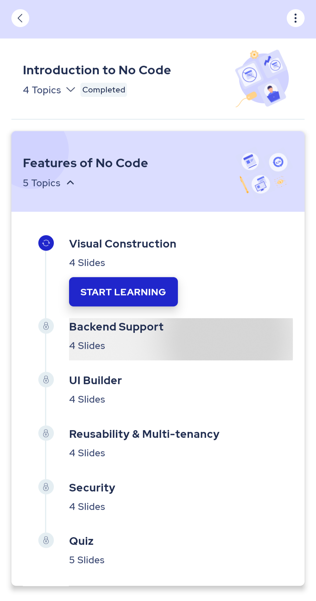
original course topic page.

redesigned course topic page with a glance glossary feature on highlighted keywords.

Users reported that they often ended up switching from the pro app to a search engine back and forth just to look for meanings of several technical words they encountered while learning through a course. This consequently also impacted their learning experience while attending the course and increased app exit rates. To combat high app exit rates and offer an uninterrupted learning experience, I ideated and designed an in-app glossary. This enabled users to quickly look up the meaning of highlighted technical words at a glance without leaving the pro app.
My learnings
I conducted rapid usability testing with 10 participants to validate design decisions. This testing was conducted with the aim of evaluating clarity and understanding the user perceptions towards different feature implementations designed to accommodate user habits and requests.

Iterating designs upon observing user habits
I came to understand the significance of improvising product design based on user habits. Had users not reported their learning habits, it would have been difficult to perceive the high app exit rates users faced while looking for the meaning of technical words on search engines. Designing a glossary feature not only reduced app exit rates but also promoted an immersive learning experience that improvised the overall app user experience that encouraged immersive supplemental knowledge among users.

Leveraging microcopy to encourage engagement
There are instances in which a good design may not be just enough, especially when users are expected to interact with it. People are fond of scanning any space they come across and a digital mobile platform is no exception. Addition of a thoughtful copy that playfully informs users of a utility/benefit of a section and can encourage users to continue interacting with the platform in newer ways.

You may also like

Back to Top